UIUX screens

Notion dynamically detects when you type specific words such as 'Debrief' and displays a tooltip providing a potential way their AI tool could help with note-taking. By introducing the feature at a time where it might be helpful to the user, Notion increases the likelihood of feature adoption, which is also aided by the gentle framing of the prompt as a question ("Is this for a debrief?"), which softens the promotion and makes it feel more like a suggestion.
Categories
Productivity
Tech
Key UI components/flows
Tooltip
Dynamic CTA
Design psychology used
Nudges
Feature discoverability Progressive disclosure

New tabs in Brave show statistics on how many trackers & ads Brave has blocked, as well as how much bandwidth & time it has saved you. Not only does it act as a continual reminder of Brave's effectiveness, it also creates an Aha! moment early on wherein you concretely see how Brave has benefitted you (e.g., "oh—it's already saved me two minutes"). It also leverages investment loops as seeing these growing stats reinforces the idea that you've invested time and effort into Brave, making you more likely to continue using it.
Categories
Tech
Key UI components/flows
Statistics
Design psychology used
Aha! moment
Endowment effect

OH! A potato firstly chooses a strategic time to ask to send you notifications (during the "We'll remind you before your trial ends" screen.) If you deny this request, they link it back to the trial reminder, which is directly beneficial to the user. Due to loss aversion, you're likely to enable notifications so you get the trial ending reminder.
Categories
Food
Lifestyle
Key UI components/flows
Modals
Design psychology used
Loss aversion
Framing

When using the Brave search engine, clicking the ‘Paste & Go’ button allows you to directly paste the content on your clipboard and search, skipping a step (pressing the 'search' button) and therefore making searching faster. This reduces cognitive load for the user; additionally, this screen utilizes Fitt's Law due to the button's size and positioning (large and close to the search bar.)
Categories
Tech
Key UI components/flows
Search bar
Design psychology used
Reducing cognitive load
Fitt's law

During onboarding, Dice prompts users to link their Spotify or Apple Music to the app. This allows Dice to create a more personalized experience and to suggest events that users are more likely to be interested in, increasing the likelihood that users will actually attend those events and therefore find the app helpful.
Categories
Entertainment
Key UI components/flows
Dynamic card
Design psychology used
Personalization

During account creation, Mercury will nudge you to let you know if your password was found in a public database and is therefore easily hackable. This is particularly crucial as Mercury handles your finances and has access to sensitive financial information. By letting you know your password is weak without explicitly telling you to change it, Mercury also ensures that users won't get irritated and feel forced into a decision.
Categories
Finance
Tech
Key UI components/flows
Onboarding
Design psychology used
Nudges
Visibility of system status (Jakob's Law #1)

When cancelling your premium Canva subscription, Canva utilizes a variety of techniques to try to stop you. For one, it introduces friction through the multiple cancellation screens and steps. Aside from the side-by-side image comparison that subtly reinforces Canva Pro’s value, it also provides targeted solutions based on your cancellation reason—whether it’s cost, lack of use, or technical issues. By offering alternatives like case studies for inspiration or direct support for troubleshooting, Canva taps into loss aversion, reminding users of what they’ll be giving up and making cancellation feel like a bigger decision.
Categories
Design
Key UI components/flows
Subscription cancellation
Design psychology used
Loss aversion
Friction


Pokemon TCG Pocket leverages the Zeigarnik effect, only giving you a small preview of an unobtained card and not letting you view it on a larger scale. This is because when viewers feel they've obtained something, much of the dopamine rush that comes with actually obtaining it is already spent, often making them mentally 'check it off' prematurely. By keeping the full card just out of reach, the game maintains a sense of incompleteness and anticipation, ensuring that players stay motivated to continue collecting rather than losing interest too soon.
Categories
Gaming
Key UI components/flows
Detail view
Design psychology used
Zeigarnik effect


Google Maps allows users to customize their vehicle icon, adding a small but meaningful layer of personalization to the app. By letting users select a car model and color, the app taps into the IKEA effect, where people feel more invested in something they’ve had a hand in creating. Additionally, Google Maps offers the customization dynamically—when users choose the driving option—but also allows for it to be changed manually in settings.
Categories
Travel
Key UI components/flows
User selection
Design psychology used
IKEA Effect

On the 'amount of CO2 saved' page, Uber frames the amount of CO2 you’ve saved by comparing it to other things—such as the amount of gas consumed or waste recycled—to better contextualize your savings and help users picture the amount of CO2 they've actually saved, which incentivizes further saving.
Categories
Travel
Key UI components/flows
Summary card
Design psychology used
Framing
Nudge

HabitGo’s "Give a good rating" prompt uses framing to nudge users toward a positive review by presupposing a good experience. Additionally, placing it in the profile menu makes it feel like a natural action rather than a manipulative request, increasing the likelihood of engagement.
Categories
Productivity
Lifestyle
Key UI components/flows
Profile menu
Design psychology used
Framing

When you reach certain milestones for the number of cards collected (e.g. 100, 151, 200, 777, 1000), Pokemon TCG Pocket congratulates you by visually listing all the cards you've obtained, as well as a fun fact about the number of cards that relates back to the Pokemon franchise. Utilizing investment loops (users invest effort in hopes for a future reward—here, that's the validation brought by this congratulations screen), Pokemon TCG Pocket not only ties the number of collected cards back to the franchise, reinforcing brand loyalty, but also makes you excited for the next milestone.
Categories
Gaming
Communities
Key UI components/flows
Celebratory moment
Design psychology used
Investment loops
User delight

Arc leverages the IKEA effect—wherein users become more invested in something when they have a hand in creating it—and creates a sense of ownership and agency by making you pick your own icon. Additionally, the app icon is now tailored to your preferences.
Categories
Tech
Productivity
Key UI components/flows
Onboarding
Design psychology used
IKEA effect

Airbuds dynamically shows how long you've been on the app, leveraging the sunk cost effect—wherein people will be less likely to drop something they've invested time and energy in.
Categories
Media
Social
Key UI components/flows
Status banner
Design psychology used
Sunk cost effect

On Milanote's mobile app, the empty state includes an illustration and a reassuring message that notes are synced between the user's phone and computer. This lessens user concerns, which is particularly crucial as Milanote, being a tool for creating visual boards, likely has a user base that has crucial work or project-related information saved.
Categories
Productivity
Design
Key UI components/flows
Informational message
Empty state illustration
Design psychology used
Visibility of system status (Jakob's Law #1)

Epicurious leverages the endowment effect by allowing you to choose your dietary preferences and customizing its recommended recipes accordingly. Since you've invested time and energy into selecting your preferences, you're more likely to stick with Epicurious.
Categories
Food
Lifestyle
Key UI components/flows
Preference selection
Design psychology used
Endowment effect

Rooms has a delightful and dynamic confetti animation that appears when you like someone's creation. The confetti forms to the shape of the structure, incentivizing liking projects as you'll be able to see how the confetti interacts differently with each build.
Categories
Gaming
Communities
Key UI components/flows
Discovery page
Content card
Design psychology used
User delight


Duolingo uses an avatar of Lily, a classic Duolingo character, to add a human-like presence and make users feel like they're interacting with an actual conversation partner. This is aided by the green online status indicator, which indicates that Lily is present and available.
Categories
Education
Gaming
Key UI components/flows
Upsell
Design psychology used
Anthropomorphism
During onboarding, Beehiiv asks you to verify your email. Instead of simply opening your inbox, it generates a pre-filled Gmail search query and filters your inbox to emails sent from Beehiiv within the last hour, ensuring you don't get distracted looking through your inbox and that you actually complete the onboarding step.
Categories
Communities
Tech
Key UI components/flows
Email confirmation
Onboarding
Design psychology used
Reducing cognitive load

When creating a profile for a business, LinkedIn automatically displays the information you input in a mockup on the right of the screen, reducing confusion and friction and allowing users to see the way their information is distributed immediately.
Categories
Social
Key UI components/flows
Profile creation
Design psychology used
Visibility of system status (Jakob's law #1)
Cognitive load reduction

When asking about potentially sensitive information such as whether someone's phone is paid off, Mint Mobile provides context on why they're asking to lessen user resistance against divulging sensitive information.
Categories
Tech
Key UI components/flows
Tooltip
Design psychology used
Contextual transparency

When previewing a survey and encountering required fields that aren’t filled out, Tally allows creators to ignore the requirements and go to the next page or submit, allowing for easier testing.
Categories
Productivity
Tech
Key UI components/flows
Tooltip
Design psychology used
User delight


On creating a new account, Soundmap gives you a ranking (here, it's 1.5M), subtly signalling the size of their user base—letting you know they have at least 1.5M users—and therefore leveraging social proof.
Categories
Gaming
Media
Key UI components/flows
Onboarding
Design psychology used
Social proof
UIUX screens
UX
'Debrief'
Notion dynamically detects when you type specific words such as 'Debrief' and displays a tooltip providing a potential way their AI tool could help with note-taking. By introducing the feature at a time where it might be helpful to the user, Notion increases the likelihood of feature adoption, which is also aided by the gentle framing of the prompt as a question ("Is this for a debrief?"), which softens the promotion and makes it feel more like a suggestion.
Categories
Productivity
Tech
Key UI components/flows
Tooltip
Dynamic CTA
Design psychology used
Nudges
Feature discoverability Progressive disclosure
UX
Trackers & ads blocked, bandwidth & time saved
New tabs in Brave show statistics on how many trackers & ads Brave has blocked, as well as how much bandwidth & time it has saved you. Not only does it act as a continual reminder of Brave's effectiveness, it also creates an Aha! moment early on wherein you concretely see how Brave has benefitted you (e.g., "oh—it's already saved me two minutes"). It also leverages investment loops as seeing these growing stats reinforces the idea that you've invested time and effort into Brave, making you more likely to continue using it.
Categories
Tech
Key UI components/flows
Statistics
Design psychology used
Aha! moment
Endowment effect
Are you sure you don’t want notifications?
OH! A potato firstly chooses a strategic time to ask to send you notifications (during the "We'll remind you before your trial ends" screen.) If you deny this request, they link it back to the trial reminder, which is directly beneficial to the user. Due to loss aversion, you're likely to enable notifications so you get the trial ending reminder.
Categories
Food
Lifestyle
Key UI components/flows
Modals
Design psychology used
Loss aversion
Framing
UX
Paste & Go
When using the Brave search engine, clicking the ‘Paste & Go’ button allows you to directly paste the content on your clipboard and search, skipping a step (pressing the 'search' button) and therefore making searching faster. This reduces cognitive load for the user; additionally, this screen utilizes Fitt's Law due to the button's size and positioning (large and close to the search bar.)
Categories
Tech
Key UI components/flows
Search bar
Design psychology used
Reducing cognitive load
Fitt's law
UX
Spotify recommendations
During onboarding, Dice prompts users to link their Spotify or Apple Music to the app. This allows Dice to create a more personalized experience and to suggest events that users are more likely to be interested in, increasing the likelihood that users will actually attend those events and therefore find the app helpful.
Categories
Entertainment
Key UI components/flows
Dynamic card
Design psychology used
Personalization
UX
Database of breached passwords
During account creation, Mercury will nudge you to let you know if your password was found in a public database and is therefore easily hackable. This is particularly crucial as Mercury handles your finances and has access to sensitive financial information. By letting you know your password is weak without explicitly telling you to change it, Mercury also ensures that users won't get irritated and feel forced into a decision.
Categories
Finance
Tech
Key UI components/flows
Onboarding
Design psychology used
Nudges
Visibility of system status (Jakob's Law #1)
UX
Why do you want to cancel?
When cancelling your premium Canva subscription, Canva utilizes a variety of techniques to try to stop you. For one, it introduces friction through the multiple cancellation screens and steps. Aside from the side-by-side image comparison that subtly reinforces Canva Pro’s value, it also provides targeted solutions based on your cancellation reason—whether it’s cost, lack of use, or technical issues. By offering alternatives like case studies for inspiration or direct support for troubleshooting, Canva taps into loss aversion, reminding users of what they’ll be giving up and making cancellation feel like a bigger decision.
Categories
Design
Key UI components/flows
Subscription cancellation
Design psychology used
Loss aversion
Friction
New to you
Built for Mars identifies and frames content you haven't read yet as 'New to you,' adding a personalized touch and also ensuring that old content doesn't go unread.
Categories
Design
Education
Key UI components/flows
Content card
Design psychology used
Framing
No magnified preview
Pokemon TCG Pocket leverages the Zeigarnik effect, only giving you a small preview of an unobtained card and not letting you view it on a larger scale. This is because when viewers feel they've obtained something, much of the dopamine rush that comes with actually obtaining it is already spent, often making them mentally 'check it off' prematurely. By keeping the full card just out of reach, the game maintains a sense of incompleteness and anticipation, ensuring that players stay motivated to continue collecting rather than losing interest too soon.
Categories
Gaming
Key UI components/flows
Detail view
Design psychology used
Zeigarnik effect
UI
Illustration-heavy welcome screen
Categories
Entertainment
Communities
Key UI components/flows
Welcome screen
CTA
Choose your own vehicle
Google Maps allows users to customize their vehicle icon, adding a small but meaningful layer of personalization to the app. By letting users select a car model and color, the app taps into the IKEA effect, where people feel more invested in something they’ve had a hand in creating. Additionally, Google Maps offers the customization dynamically—when users choose the driving option—but also allows for it to be changed manually in settings.
Categories
Travel
Key UI components/flows
User selection
Design psychology used
IKEA Effect
UX
Estimated CO2 saved
On the 'amount of CO2 saved' page, Uber frames the amount of CO2 you’ve saved by comparing it to other things—such as the amount of gas consumed or waste recycled—to better contextualize your savings and help users picture the amount of CO2 they've actually saved, which incentivizes further saving.
Categories
Travel
Key UI components/flows
Summary card
Design psychology used
Framing
Nudge
UX
Give a good rating
HabitGo’s "Give a good rating" prompt uses framing to nudge users toward a positive review by presupposing a good experience. Additionally, placing it in the profile menu makes it feel like a natural action rather than a manipulative request, increasing the likelihood of engagement.
Categories
Productivity
Lifestyle
Key UI components/flows
Profile menu
Design psychology used
Framing
X cards collected
When you reach certain milestones for the number of cards collected (e.g. 100, 151, 200, 777, 1000), Pokemon TCG Pocket congratulates you by visually listing all the cards you've obtained, as well as a fun fact about the number of cards that relates back to the Pokemon franchise. Utilizing investment loops (users invest effort in hopes for a future reward—here, that's the validation brought by this congratulations screen), Pokemon TCG Pocket not only ties the number of collected cards back to the franchise, reinforcing brand loyalty, but also makes you excited for the next milestone.
Categories
Gaming
Communities
Key UI components/flows
Celebratory moment
Design psychology used
Investment loops
User delight
Pick a home screen icon
Arc leverages the IKEA effect—wherein users become more invested in something when they have a hand in creating it—and creates a sense of ownership and agency by making you pick your own icon. Additionally, the app icon is now tailored to your preferences.
Categories
Tech
Productivity
Key UI components/flows
Onboarding
Design psychology used
IKEA effect
UX
On Airbuds for x days
Airbuds dynamically shows how long you've been on the app, leveraging the sunk cost effect—wherein people will be less likely to drop something they've invested time and energy in.
Categories
Media
Social
Key UI components/flows
Status banner
Design psychology used
Sunk cost effect
UX
Synced to laptop
On Milanote's mobile app, the empty state includes an illustration and a reassuring message that notes are synced between the user's phone and computer. This lessens user concerns, which is particularly crucial as Milanote, being a tool for creating visual boards, likely has a user base that has crucial work or project-related information saved.
Categories
Productivity
Design
Key UI components/flows
Informational message
Empty state illustration
Design psychology used
Visibility of system status (Jakob's Law #1)
Input dietary preferences
Epicurious leverages the endowment effect by allowing you to choose your dietary preferences and customizing its recommended recipes accordingly. Since you've invested time and energy into selecting your preferences, you're more likely to stick with Epicurious.
Categories
Food
Lifestyle
Key UI components/flows
Preference selection
Design psychology used
Endowment effect
UX
Like for confetti
Rooms has a delightful and dynamic confetti animation that appears when you like someone's creation. The confetti forms to the shape of the structure, incentivizing liking projects as you'll be able to see how the confetti interacts differently with each build.
Categories
Gaming
Communities
Key UI components/flows
Discovery page
Content card
Design psychology used
User delight
Number of wins displayed
As Gamepigeon is directly available in iMessage, people get to constantly view how many wins they have against others, allowing them to reaffirm and show off their successes.
Categories
Gaming
Social
Key UI components/flows
Menu
Design psychology used
Recognition effect
UX
On call with Lily
Duolingo uses an avatar of Lily, a classic Duolingo character, to add a human-like presence and make users feel like they're interacting with an actual conversation partner. This is aided by the green online status indicator, which indicates that Lily is present and available.
Categories
Education
Gaming
Key UI components/flows
Upsell
Design psychology used
Anthropomorphism
UX
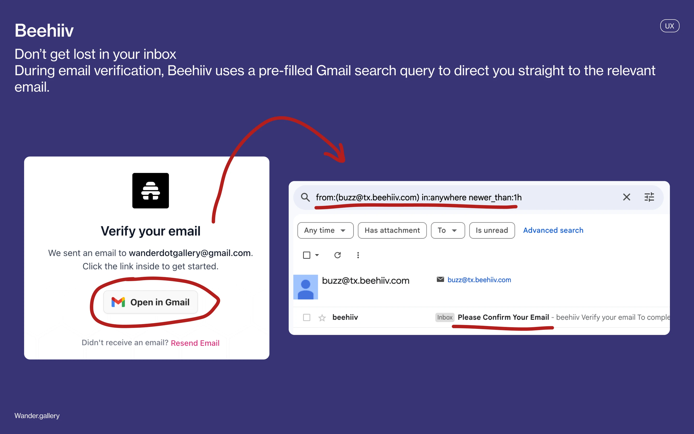
Don’t get lost in your inbox
During onboarding, Beehiiv asks you to verify your email. Instead of simply opening your inbox, it generates a pre-filled Gmail search query and filters your inbox to emails sent from Beehiiv within the last hour, ensuring you don't get distracted looking through your inbox and that you actually complete the onboarding step.
Categories
Communities
Tech
Key UI components/flows
Email confirmation
Onboarding
Design psychology used
Reducing cognitive load
UX
Instant preview when creating business profile
When creating a profile for a business, LinkedIn automatically displays the information you input in a mockup on the right of the screen, reducing confusion and friction and allowing users to see the way their information is distributed immediately.
Categories
Social
Key UI components/flows
Profile creation
Design psychology used
Visibility of system status (Jakob's law #1)
Cognitive load reduction

UI
Listening clock
Categories
Media
Entertainment
Key UI components/flows
Charts
Providing context for sensitive information
When asking about potentially sensitive information such as whether someone's phone is paid off, Mint Mobile provides context on why they're asking to lessen user resistance against divulging sensitive information.
Categories
Tech
Key UI components/flows
Tooltip
Design psychology used
Contextual transparency
UX
Continue anyway in preview mode
When previewing a survey and encountering required fields that aren’t filled out, Tally allows creators to ignore the requirements and go to the next page or submit, allowing for easier testing.
Categories
Productivity
Tech
Key UI components/flows
Tooltip
Design psychology used
User delight
Y2K-inspired social media home page
Categories
Social
Communities
Key UI components/flows
Navigation
Content feed
UX
First 1.5 million users
On creating a new account, Soundmap gives you a ranking (here, it's 1.5M), subtly signalling the size of their user base—letting you know they have at least 1.5M users—and therefore leveraging social proof.
Categories
Gaming
Media
Key UI components/flows
Onboarding
Design psychology used
Social proof
UIUX screens
UX
'Debrief'
Notion dynamically detects when you type specific words such as 'Debrief' and displays a tooltip providing a potential way their AI tool could help with note-taking. By introducing the feature at a time where it might be helpful to the user, Notion increases the likelihood of feature adoption, which is also aided by the gentle framing of the prompt as a question ("Is this for a debrief?"), which softens the promotion and makes it feel more like a suggestion.
Categories
Productivity
Tech
Key UI components/flows
Tooltip
Dynamic CTA
Design psychology used
Nudges
Feature discoverability Progressive disclosure
UX
Trackers & ads blocked, bandwidth & time saved
New tabs in Brave show statistics on how many trackers & ads Brave has blocked, as well as how much bandwidth & time it has saved you. Not only does it act as a continual reminder of Brave's effectiveness, it also creates an Aha! moment early on wherein you concretely see how Brave has benefitted you (e.g., "oh—it's already saved me two minutes"). It also leverages investment loops as seeing these growing stats reinforces the idea that you've invested time and effort into Brave, making you more likely to continue using it.
Categories
Tech
Key UI components/flows
Statistics
Design psychology used
Aha! moment
Endowment effect
Are you sure you don’t want notifications?
OH! A potato firstly chooses a strategic time to ask to send you notifications (during the "We'll remind you before your trial ends" screen.) If you deny this request, they link it back to the trial reminder, which is directly beneficial to the user. Due to loss aversion, you're likely to enable notifications so you get the trial ending reminder.
Categories
Food
Lifestyle
Key UI components/flows
Modals
Design psychology used
Loss aversion
Framing
UX
Paste & Go
When using the Brave search engine, clicking the ‘Paste & Go’ button allows you to directly paste the content on your clipboard and search, skipping a step (pressing the 'search' button) and therefore making searching faster. This reduces cognitive load for the user; additionally, this screen utilizes Fitt's Law due to the button's size and positioning (large and close to the search bar.)
Categories
Tech
Key UI components/flows
Search bar
Design psychology used
Reducing cognitive load
Fitt's law
UX
Spotify recommendations
During onboarding, Dice prompts users to link their Spotify or Apple Music to the app. This allows Dice to create a more personalized experience and to suggest events that users are more likely to be interested in, increasing the likelihood that users will actually attend those events and therefore find the app helpful.
Categories
Entertainment
Key UI components/flows
Dynamic card
Design psychology used
Personalization
UX
Database of breached passwords
During account creation, Mercury will nudge you to let you know if your password was found in a public database and is therefore easily hackable. This is particularly crucial as Mercury handles your finances and has access to sensitive financial information. By letting you know your password is weak without explicitly telling you to change it, Mercury also ensures that users won't get irritated and feel forced into a decision.
Categories
Finance
Tech
Key UI components/flows
Onboarding
Design psychology used
Nudges
Visibility of system status (Jakob's Law #1)
UX
Why do you want to cancel?
When cancelling your premium Canva subscription, Canva utilizes a variety of techniques to try to stop you. For one, it introduces friction through the multiple cancellation screens and steps. Aside from the side-by-side image comparison that subtly reinforces Canva Pro’s value, it also provides targeted solutions based on your cancellation reason—whether it’s cost, lack of use, or technical issues. By offering alternatives like case studies for inspiration or direct support for troubleshooting, Canva taps into loss aversion, reminding users of what they’ll be giving up and making cancellation feel like a bigger decision.
Categories
Design
Key UI components/flows
Subscription cancellation
Design psychology used
Loss aversion
Friction
New to you
Built for Mars identifies and frames content you haven't read yet as 'New to you,' adding a personalized touch and also ensuring that old content doesn't go unread.
Categories
Design
Education
Key UI components/flows
Content card
Design psychology used
Framing
No magnified preview
Pokemon TCG Pocket leverages the Zeigarnik effect, only giving you a small preview of an unobtained card and not letting you view it on a larger scale. This is because when viewers feel they've obtained something, much of the dopamine rush that comes with actually obtaining it is already spent, often making them mentally 'check it off' prematurely. By keeping the full card just out of reach, the game maintains a sense of incompleteness and anticipation, ensuring that players stay motivated to continue collecting rather than losing interest too soon.
Categories
Gaming
Key UI components/flows
Detail view
Design psychology used
Zeigarnik effect
UI
Illustration-heavy welcome screen
Categories
Entertainment
Communities
Key UI components/flows
Welcome screen
CTA
Choose your own vehicle
Google Maps allows users to customize their vehicle icon, adding a small but meaningful layer of personalization to the app. By letting users select a car model and color, the app taps into the IKEA effect, where people feel more invested in something they’ve had a hand in creating. Additionally, Google Maps offers the customization dynamically—when users choose the driving option—but also allows for it to be changed manually in settings.
Categories
Travel
Key UI components/flows
User selection
Design psychology used
IKEA Effect
UX
Estimated CO2 saved
On the 'amount of CO2 saved' page, Uber frames the amount of CO2 you’ve saved by comparing it to other things—such as the amount of gas consumed or waste recycled—to better contextualize your savings and help users picture the amount of CO2 they've actually saved, which incentivizes further saving.
Categories
Travel
Key UI components/flows
Summary card
Design psychology used
Framing
Nudge
UX
Give a good rating
HabitGo’s "Give a good rating" prompt uses framing to nudge users toward a positive review by presupposing a good experience. Additionally, placing it in the profile menu makes it feel like a natural action rather than a manipulative request, increasing the likelihood of engagement.
Categories
Productivity
Lifestyle
Key UI components/flows
Profile menu
Design psychology used
Framing
X cards collected
When you reach certain milestones for the number of cards collected (e.g. 100, 151, 200, 777, 1000), Pokemon TCG Pocket congratulates you by visually listing all the cards you've obtained, as well as a fun fact about the number of cards that relates back to the Pokemon franchise. Utilizing investment loops (users invest effort in hopes for a future reward—here, that's the validation brought by this congratulations screen), Pokemon TCG Pocket not only ties the number of collected cards back to the franchise, reinforcing brand loyalty, but also makes you excited for the next milestone.
Categories
Gaming
Communities
Key UI components/flows
Celebratory moment
Design psychology used
Investment loops
User delight
Pick a home screen icon
Arc leverages the IKEA effect—wherein users become more invested in something when they have a hand in creating it—and creates a sense of ownership and agency by making you pick your own icon. Additionally, the app icon is now tailored to your preferences.
Categories
Tech
Productivity
Key UI components/flows
Onboarding
Design psychology used
IKEA effect
UX
On Airbuds for x days
Airbuds dynamically shows how long you've been on the app, leveraging the sunk cost effect—wherein people will be less likely to drop something they've invested time and energy in.
Categories
Media
Social
Key UI components/flows
Status banner
Design psychology used
Sunk cost effect
UX
Synced to laptop
On Milanote's mobile app, the empty state includes an illustration and a reassuring message that notes are synced between the user's phone and computer. This lessens user concerns, which is particularly crucial as Milanote, being a tool for creating visual boards, likely has a user base that has crucial work or project-related information saved.
Categories
Productivity
Design
Key UI components/flows
Informational message
Empty state illustration
Design psychology used
Visibility of system status (Jakob's Law #1)
Input dietary preferences
Epicurious leverages the endowment effect by allowing you to choose your dietary preferences and customizing its recommended recipes accordingly. Since you've invested time and energy into selecting your preferences, you're more likely to stick with Epicurious.
Categories
Food
Lifestyle
Key UI components/flows
Preference selection
Design psychology used
Endowment effect
UX
Like for confetti
Rooms has a delightful and dynamic confetti animation that appears when you like someone's creation. The confetti forms to the shape of the structure, incentivizing liking projects as you'll be able to see how the confetti interacts differently with each build.
Categories
Gaming
Communities
Key UI components/flows
Discovery page
Content card
Design psychology used
User delight
Number of wins displayed
As Gamepigeon is directly available in iMessage, people get to constantly view how many wins they have against others, allowing them to reaffirm and show off their successes.
Categories
Gaming
Social
Key UI components/flows
Menu
Design psychology used
Recognition effect
UX
On call with Lily
Duolingo uses an avatar of Lily, a classic Duolingo character, to add a human-like presence and make users feel like they're interacting with an actual conversation partner. This is aided by the green online status indicator, which indicates that Lily is present and available.
Categories
Education
Gaming
Key UI components/flows
Upsell
Design psychology used
Anthropomorphism
UX
Don’t get lost in your inbox
During onboarding, Beehiiv asks you to verify your email. Instead of simply opening your inbox, it generates a pre-filled Gmail search query and filters your inbox to emails sent from Beehiiv within the last hour, ensuring you don't get distracted looking through your inbox and that you actually complete the onboarding step.
Categories
Communities
Tech
Key UI components/flows
Email confirmation
Onboarding
Design psychology used
Reducing cognitive load
UX
Instant preview when creating business profile
When creating a profile for a business, LinkedIn automatically displays the information you input in a mockup on the right of the screen, reducing confusion and friction and allowing users to see the way their information is distributed immediately.
Categories
Social
Key UI components/flows
Profile creation
Design psychology used
Visibility of system status (Jakob's law #1)
Cognitive load reduction
UI
Listening clock
Categories
Media
Entertainment
Key UI components/flows
Charts
Providing context for sensitive information
When asking about potentially sensitive information such as whether someone's phone is paid off, Mint Mobile provides context on why they're asking to lessen user resistance against divulging sensitive information.
Categories
Tech
Key UI components/flows
Tooltip
Design psychology used
Contextual transparency
UX
Continue anyway in preview mode
When previewing a survey and encountering required fields that aren’t filled out, Tally allows creators to ignore the requirements and go to the next page or submit, allowing for easier testing.
Categories
Productivity
Tech
Key UI components/flows
Tooltip
Design psychology used
User delight
Y2K-inspired social media home page
Categories
Social
Communities
Key UI components/flows
Navigation
Content feed
UX
First 1.5 million users
On creating a new account, Soundmap gives you a ranking (here, it's 1.5M), subtly signalling the size of their user base—letting you know they have at least 1.5M users—and therefore leveraging social proof.
Categories
Gaming
Media
Key UI components/flows
Onboarding
Design psychology used
Social proof
Sign up for our newsletter
Only the best of Wander.
© 2025 Wander.gallery